How do you serve the right call to action for the right person, in the right place, at the right time?
Hover over this sunburst chart to explore 600 potential paths and content variants. Click arrows to narrow paths for personalized journeys by new or returning visitors (best viewed on desktop)

Create a modular chart to standardize mapping data content and consistency.
With tracking and analytics, we can start to answer what success looks like?
Provide clear pathways to trigger conversions
Our website was the most important channel for lead generation and digital commerce.
Authoritative source of truth
Are critical for cross-functioning teams. I’m always on the lookout for digital transformative moments to improve our design process.
Team
Me — UX Strategy Lead
Ryan Gordan — Web Optimization Specialist
Jeannie Lee — UX Designer / Data Viz
Christian Fazio — UX Designer
Discovery
Consolidated historic and new studies


Brainstormed areas for future solutions

Prioritized ideas to reduce scope

Clustered, grouped, and ranked ideas
Insight One
A truly globalized experience for anyone anywhere
Insight Two
Accommodate complex and competing priorities, hierarchy, and detailed performance reporting
Insight Three
Implement AEM capabilities and features that enable customized views, automated site-wide updates
More research
Audit identifying all CTAs across 300 pages
Each designer conducted a deeper inventory of all CTA variations across page categories such as; Products, Industries, and Events.

Make it stand out
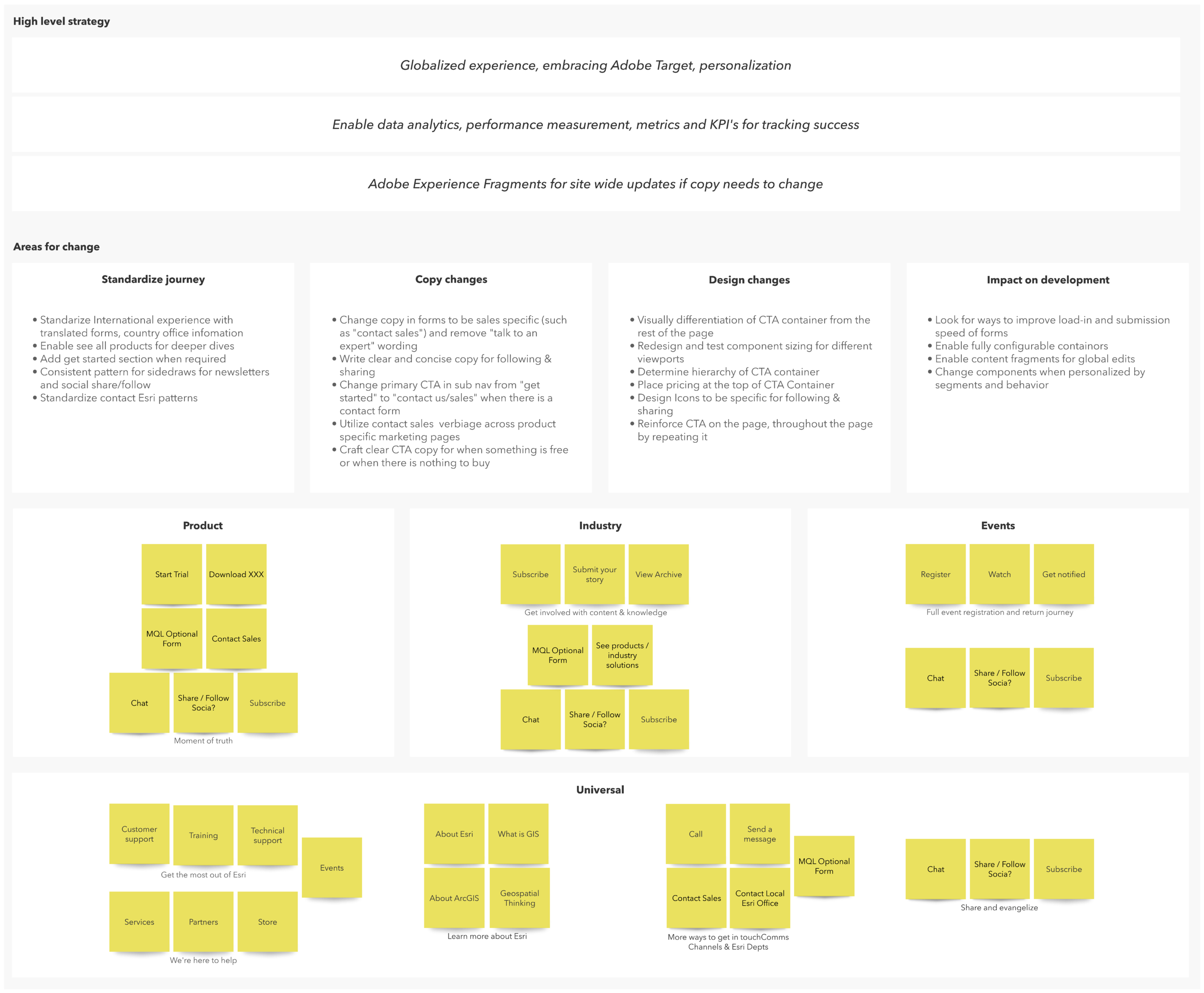
Strategy
Rationalized elements of a CTA block
Identified all elements that create CTA’s. Including page section, components, elements within the components.
3 key areas of CTA’s
Channels and business units
Headlines and copy
Buttons and labels
Pic-n-mix ingredients
Mapping all the possible variants, we created recipe cards so we could be prescriptive and recommend the correct version.
We narrowed down 3 common patterns
Consultative - you contact the Sales team, they respond
Get started - whatever you click on, you can actually start
Combined - accomodating the various requirements per product


Mapping recipes to page categories
Including accommodating for all the outliers


Mapping recipes to page types
Accommodating for when CTAs may be different on subpages of the same site

Design
High conversion zones
Now we were able to look at page structure, flow with CTA placements.
We broke up our pages into 3 core zones.
Page area
Type of CTA
Combined them with components including headline and button labels
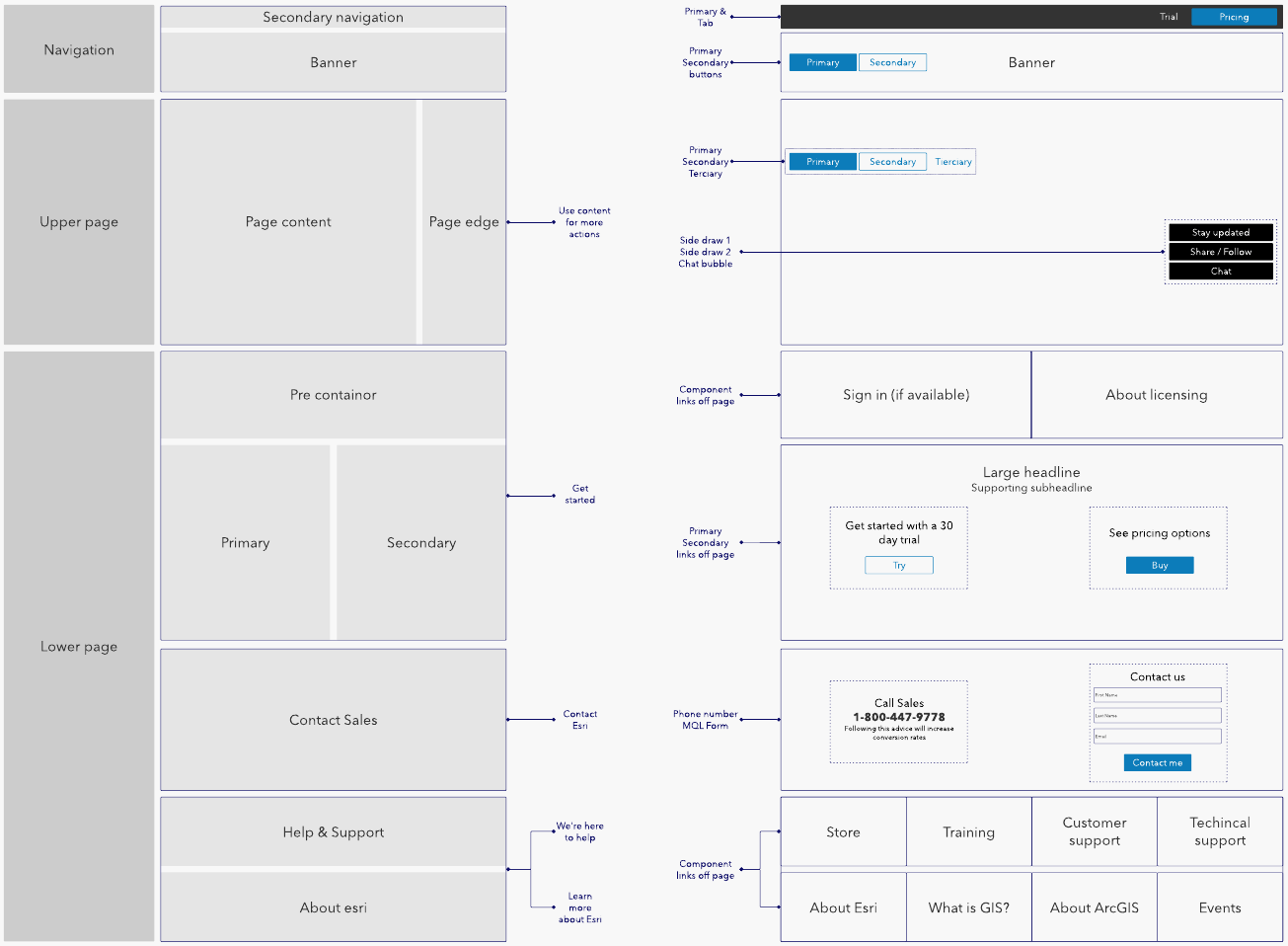
Hierarchy of information
We identified the must-have and optional sections and stacked them so it would be responsive.

Make it stand out
Wireframes + design system

Make it stand out
Whatever it is, the way you tell your story online can make all the difference.
Wireframes + all recipes

A big wicked problem…
Yup, we did it to ourselves, but we still needed a system of record to manage large volumes of information used by many people.
In our Product category we had 177 pages to maintain alone, but when adding dimensions for personalization—it delivered over 600 variables to manage.
Data visualization
We built a single spreadsheet that documented all of the recipe variants. I knew if we could get it working in Excel, we could make it work in anything.
We did create an Excel chart, but it was heavy, slow, clunky, and required a lot of manual work to customize color coding.
We needed a more robust data visualization tool that created charts or graphs automatically requiring little to zero code.
We also required storytelling features such as slides, informative rollovers, pop-ups, or narrowing down views of data.
We settled on Flourish for now, and constantly evolving it in Tableau also.


Make it personal
Finally, we added personalization, reimagining experiences that would be useful, feel thoughtful, or ideally invisible.
Such as, if you’d already subscribed to a newsletter, let’s remove it. Why show technical support to new visitors when the Techincal Support team is only available to paying customers?
By adding data layers of
Who they are (audience and segmentation)
What did they do? (dimensions of behavior)
When did they do it? (returning visitors who’ve completed a primary CTA).
We can deliver on our original goal of the right content, right time, right place.
Optimized for international visitors

Nudge expired trials to conversion

Explore meaningful follow up ideas

Key takeaways
I searched high and low for a solution for this, or cases where it had been done really well. It’s rare you get to invent something new, but it was also a result of a year in the making during Covid19.
Intimate knowledge of our pages, some self-development classes on data visualizations a few years back, along with the heads-down approach from team contributors enabled this monstrous ongoing effort.
Big outcomes
Reduce abandonment, increased conversion
Track, analyze, compare conversions for any CTA at scale (over 4000+ pages)
Rebuild our CTA component system, integrate it into the design system
Bring consistency across all pages
Consolidate and eliminate the volume of one-offs
Reduce the overwhelming number of link options to drop off
Decrease time-to-build by being more prescriptive, clearly demonstrating our recommended matrix of CTA options for new and updating projects based on performance