Service Design program to develop an automated landing page builder using Adobe Experience Manager

Internal creative teams will never meet all of their companies’ design needs. But, if we embrace enablement, we can UX ourselves out of a job so we can focus on bigger things that matter.
Why is this important?
Design democratization, streamlined workflows, and automation enabled marketers to create, build, and increase the volume of go-to-market campaigns they launched themselves.
Iterative executions & updates
100’s of team members needed to access design resources and people. By including them in research, testing, change management, we enabled smoother buy-in and adoption.
Team
Myself — Snr UX Designer
Lynnie Joseph — UX/UI Designer
Research — Phase 1
Audited hundreds of published landing pages, and interviewed our internal users

Design principles
-
One landing page per tactic
Don’t try to overextend your campaign’s paid targeted tactics.
-
Ask people to do one thing
When people do click, deliver what you promised — no more.
-
Message must align
The message and visuals must align with what they just clicked. Keep copy short, obvious, avoid jargon and cliches.
-
Create forms you'd fill out
Use the least fields possible that still ensure a qualifying lead.
-
Continuously test and improve
Run experiments with content and layouts to optimize conversion. Submit is not compelling and performs poorly.
Strategy — Phase 1
Grouped the most common business needs into big themes
We asked our stakeholders “what do you want your audience to do?”
We envisioned a 3-step process
Identify your business goal
Create messaging to increase your chances of obtaining it
Select a themed landing page template that accommodated both of the above

Information Architecture
Created overarching content chunks that all templates could pull from.

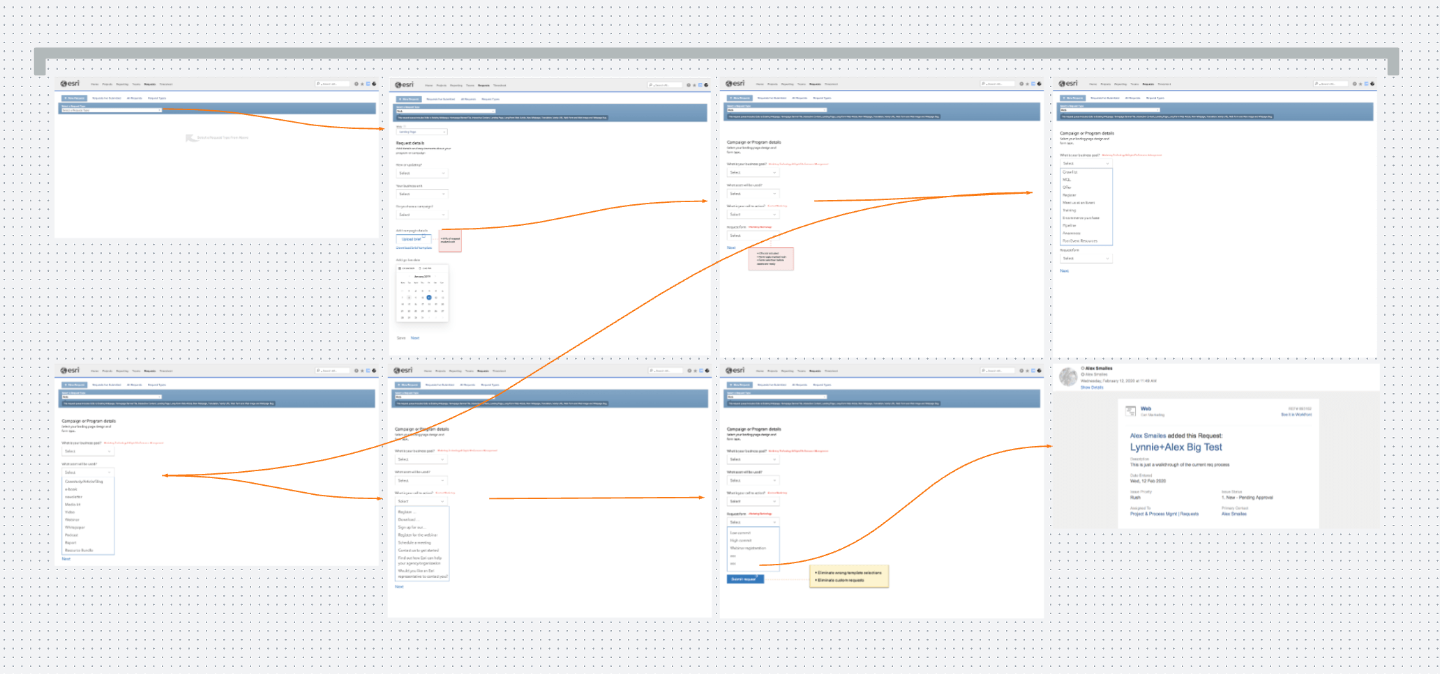
Workflow & processes
We sketched rough workflows that non-designers and project managers could deploy to get up and running.


Design — Phase 1
Templates by business goals
Our system needed to be flexible to accommodate different types of content to achieve the same goal.
Headline + messaging + form
Headline + messaging + download e-book form
Headline + messaging + read case studies + contact us form

A flexible and usable system
By simply swapping specific messaging, visuals, imagery, marketers from across product, industry, solution teams could all use the same template.
An Achilles heel…
We still needed to accommodate ‘occasional’ custom requests. So we had an off-menu option that had a similar design family feel, but we allowed customization of components. It triggered a traditional web process requiring all resources. This came back to haunt us…

Research — Phase 2
A year later, we took a hard look at the pain points and successes.
This was an opportune moment to address usability issues, explore fresh designs, and ultimately improve conversions.

Mapped our internal user’s journey
After doing a complete review of the current ‘as is’ process some serious risk issues were identified. We not only gathered user feedback, but analytics data of highest-performing templates, and blended it all with project management reports.
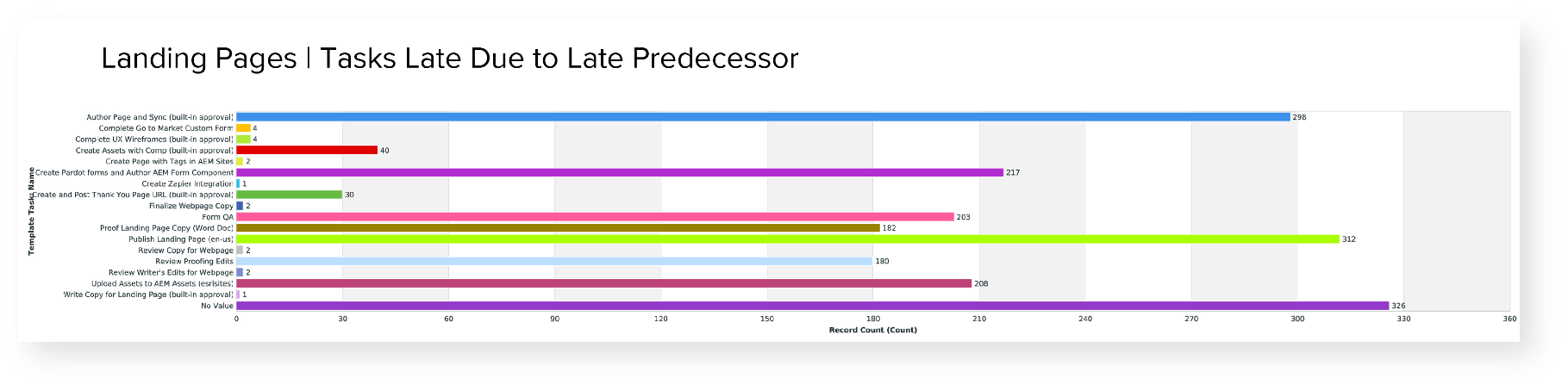
A broken process
59% of requests marked rush
272 delivered late, only 31 on time
CTA’s not included at the start
Project needs
Kill root causes
Eliminate wrong template selection and endless debates over design
Reduce or eliminate custom requests
Clearly demonstrate high-converting templates, and why to choose them
Our vision
Build at scale and increase speed
Automate decisions when possible
Reduce copy and proofing cycles
Enable more self-authoring — not less
Reduce duration from 17 to 10 days
Explore removing UX tasks completely!
Key pain points

Stakeholders
Requests are submitted without a strategy in place
As everything is always a rush, marking it urgent by default

PM’s and timelines
Requests marked rush without justification caused inaccurate prioritization
Wrong or inaccurate content causes multiple proofing and design cycles
Using unapproved assets (expensive Getty images) exposed a brand and legal risk

AEM site authors
As authoring is the last step, ALL the pressure falls on them
They bore the brunt of workaround tactics for non-approved changes
Authors wasted time reaching out for help, and doing endless rounds of edits

Copywriting & proofing
Content guidelines not utilized, ignored, or hacked together
Designer editing copy themselves to meet guidelines
Wrong content docs versions sent through proofing

UX & UI
The CTA drives template decision, it is needed upfront
Unclear strategy or content leads to changing templates midway through
No design direction caused redoing final UI comps “I don’t like it”
Design principles — Phase 2
-
Prevent premature requests
Eliminate bad projects clogging the system by making strategies and call to actions required at submitting a request stage
-
Enable automation
Utilize Workfront form features for information and requirements gathering. Create a matrix for recommended designs
-
Reduced choice
Display optimal performing templates based on metrics not gut feelings and volume of content
-
Proof once
Reduce the workload of writers and the proofing team. Utilize tools that enable constraints until dedicated writers can be sourced
-
Make yourself redundant
UXers are available for consultation but create fool-proof designs that just work
-
Eliminate risk
Restrict publishing ability by only proving paths to approved and optimized assets
Strategy — Phase 2
Reimagined a ‘To Be’ future state
Using all our previous inputs, we mapped out our recommendations counteracting the key failure points. We used these customer journey maps at the beginning of every meeting to remind decision-makers of the gravity of issues that needed to collectively resolve. Most of them are outside of our teams’ hands.

Key insights
Align Workfront process with campaign needs
Create steps and dropdowns that automate recommended designs
Use locked PDF docs
Editable PDF copy docs that are a visual 1:1 and character count match to wireframes
Allocated dedicated writers
Confirmation email
Recommended workflow
Links to our resource best practices
Expose high performing conversion rates
Fixes
Fix 1 - Updated business objectives to content and CTA options
Created a hard stop when collecting requirements, preventing incomplete requests from proceeding.

Fix 2 – Automated recommended designs
Mapped out each combination of dropdowns, to identify which matrix delivered our recommended template. Due to the simplest template being able to fulfill all the needs, we always exposed it by default.

Fix 3 – Optimized request steps in Workfront
Worked with the product owner to create dropdowns, required fields, and implemented progressive disclosure to increase chances of a successful submission.
Fix 4 – Enabled users to get started quicker
Reduced the number of steps, time for requests to be 'approved' and consolidated all information in only two locations.

Fix 5 – Connected workflows across multiple systems
After receiving a confirmation link on-screen in Workfront, it opens a new tab and takes the user to AEM anchored to the correct template.

Design — Phase 2
Fix 6 – Refreshed design templates
A parallel design effort was happening simultaneously to update the design system and added forms to hero banners.

Fix 7 – Error prevention with locked copy decks
We discovered semi-editable PDFs that created a visual 1:1 match to wireframe templates and inherited the character count restrictions so users could see immediately if their copy exceeded specs.

Fix 8 – All systems and tools in one place
The relationship between the template gallery and building in AEM meant users could reduce the number of tools they had to bounce between. Also, being an enterprise environment, there were security and account login steps to reduce.

Fix 9 – User-friendly template gallery and tools
A stunning gallery page was designed to house all of the categories of templates.
Renaming them reduced the bias from the previously ‘business objective’ named series, which caused users to think they always had to request a custom project if their project didn’t match.
Useful materials all in one place
See a live example
Download the copy content document
Get started in build mode

Link to see live examples

Download copywriting tools

Key takeaways
We released solutions iteratively, so by the time it came to present to the large volume of users, we had already started seeing performance improvements as per below.
We continue to roll out internal usability tests, created performance dashboards, start large-scale AB tests when applicable, communicate high-performing templates, and campaigns for others to learn from.
What we’re doing next…
Creating a localized image bank for personalization by global locations
Revisiting this program every 1-2 years to continue to our growth and innovation
Internal design school and learn resources for landing pages, so more resources can contribute to our speed and scaling

